COMPANY
Bynder / TomTom
ROLE
User Research
Information Architecture
Sketching / Prototyping
Visual / Interaction Design
DURATION
04/2018 – 05/2018
Bynder is a digital asset management solution platform used by TomTom to store and share visuals company-wide.
Being not only in charge of the visual design efforts for TomTom, I'm also assigned to manage this visual asset library which, helpful as it is cross-department, still lacks intuitive task flow and user-friendly structure. As a part of UC Berkeley Extension project, I took upon a responsibility to offer a redesign of the most crucial user flows to increase usability of the platform.
PROJECT OVERVIEW
PROBLEM STATEMENT
Currently users can create collections only via uploading files. User management is available for administrators only and is conducted via settings. Currently assets and collections are presented as tabs accessible from home page and any landing page.
VISION STATEMENT
The restructuring of the platform will increase productivity in using it
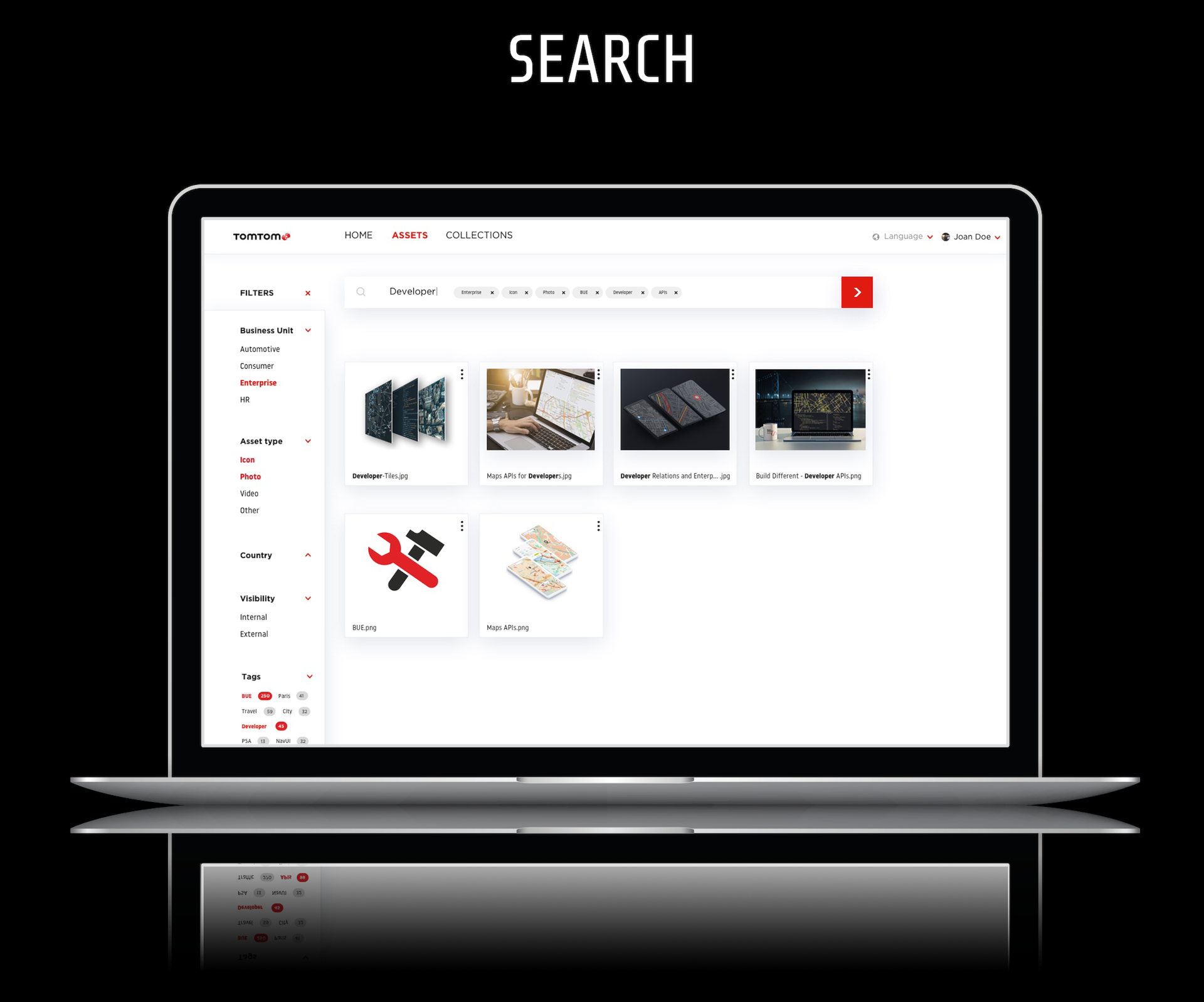
Improving the search and filtering functionality will save and will save time and hassle for stakeholders who usually get frustrated with receiving irrelevant results
Enhancing the uploading functionality will allow the stakeholder to u[load large numbers of files while labeling them, hence ensuring the precise search results
Introducing the improved “select all” feature for the uploading interface will help speed up the process of uploading multiple files with similar credentials.

CURRENT DESIGN
PERSONA


TREE TESTING

COMMON TASKS

ANALYTICS
Average completion time: 7m31s
Number of participants: 5 people
Average success score across all tasks: 58%
Average number of answers chosen without backtracking: 36%


PAINPOINTS & INSIGHTS
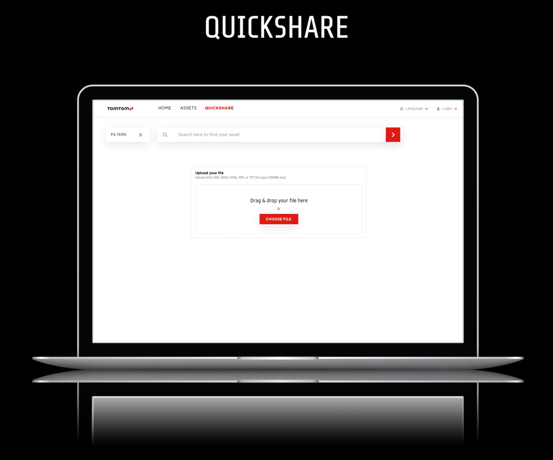
CREATING A COLLECTION
The failure of participants to complete this task successfully can be accounted for by the fact that it is counter-intuitive for users to upload a file to the site and then create a repository to place it in. Standard user behavior suggests creating a collection and uploading a file there (similar to creating a folder on desktop and placing a file in it)

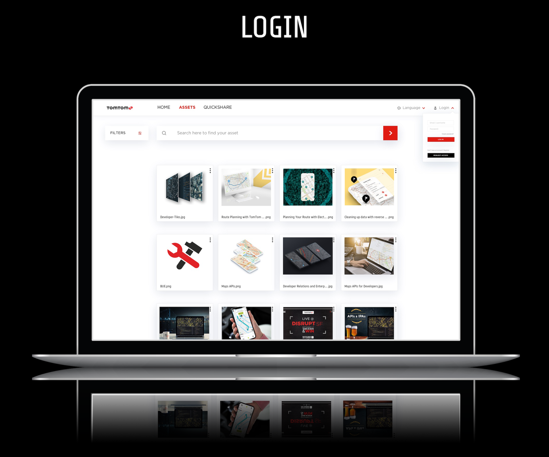
USER MANAGEMENT
User testing showed that majority of people seemed to look up the user not via the list of users which can be accessed through User Management in settings. Participants tended to attempt searching for user’s name instead to access it quicker rather than going through the database.

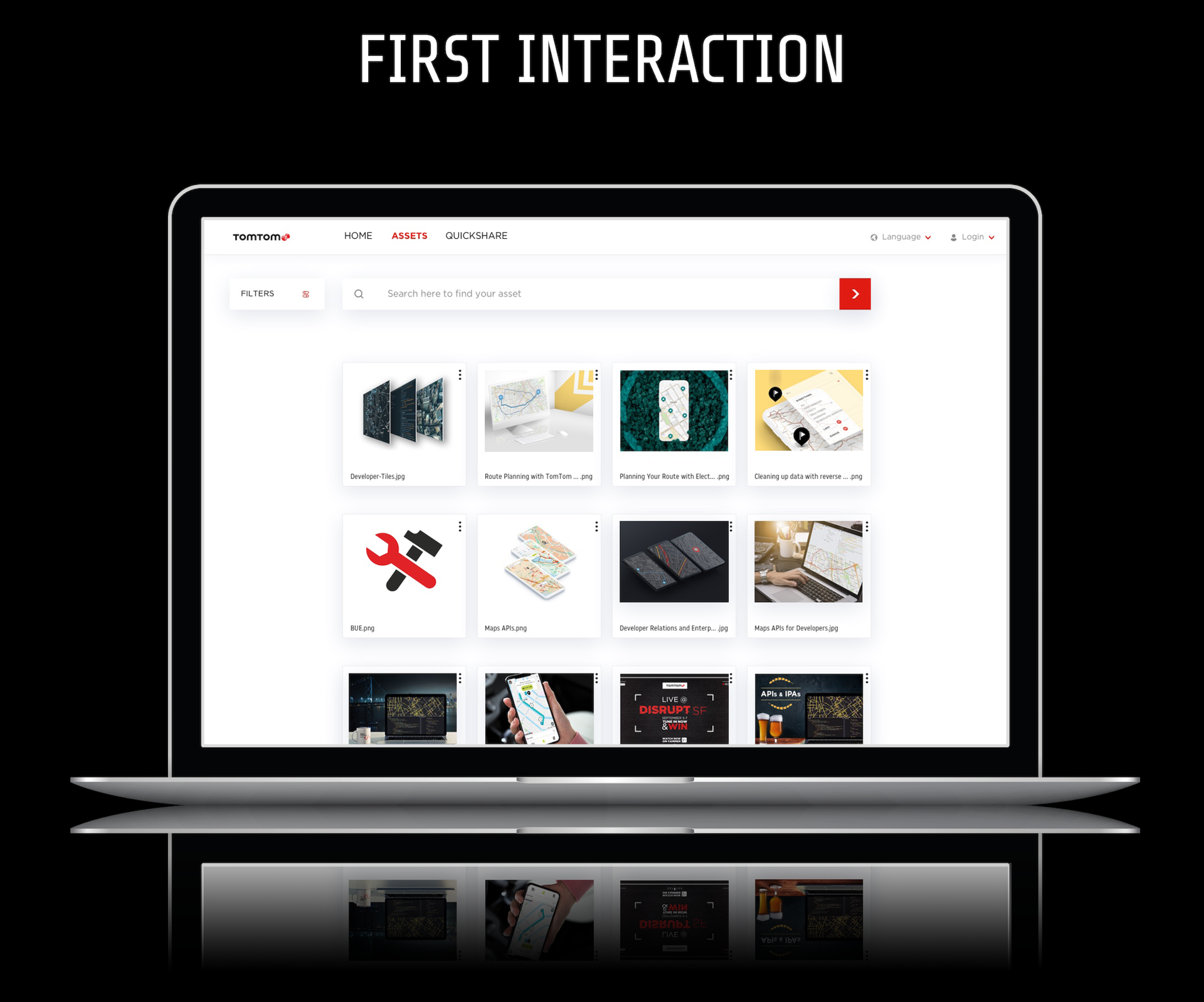
ASSETS & COLLECTIONS
The reason users seemed to click “Assets” instead of “Collections” and vise versa is that both tabs per opening represent a very similar type of layout with thumbnails. The only difference is the content. Moreover, assets are expected to be included in collections but not every collection would contain expected assets as they can exist separately.

POTENTIAL SOLUTIONS

CREATING A COLLECTION
It is important to have an option to create a collection without uploading an image. The goal for this portal is to provide as familiar and comfortable experience for users as the one they’d have on the local repositories on their PCs. Thus, having a button “Create a collection” would seem logical.
USER MANAGEMENT
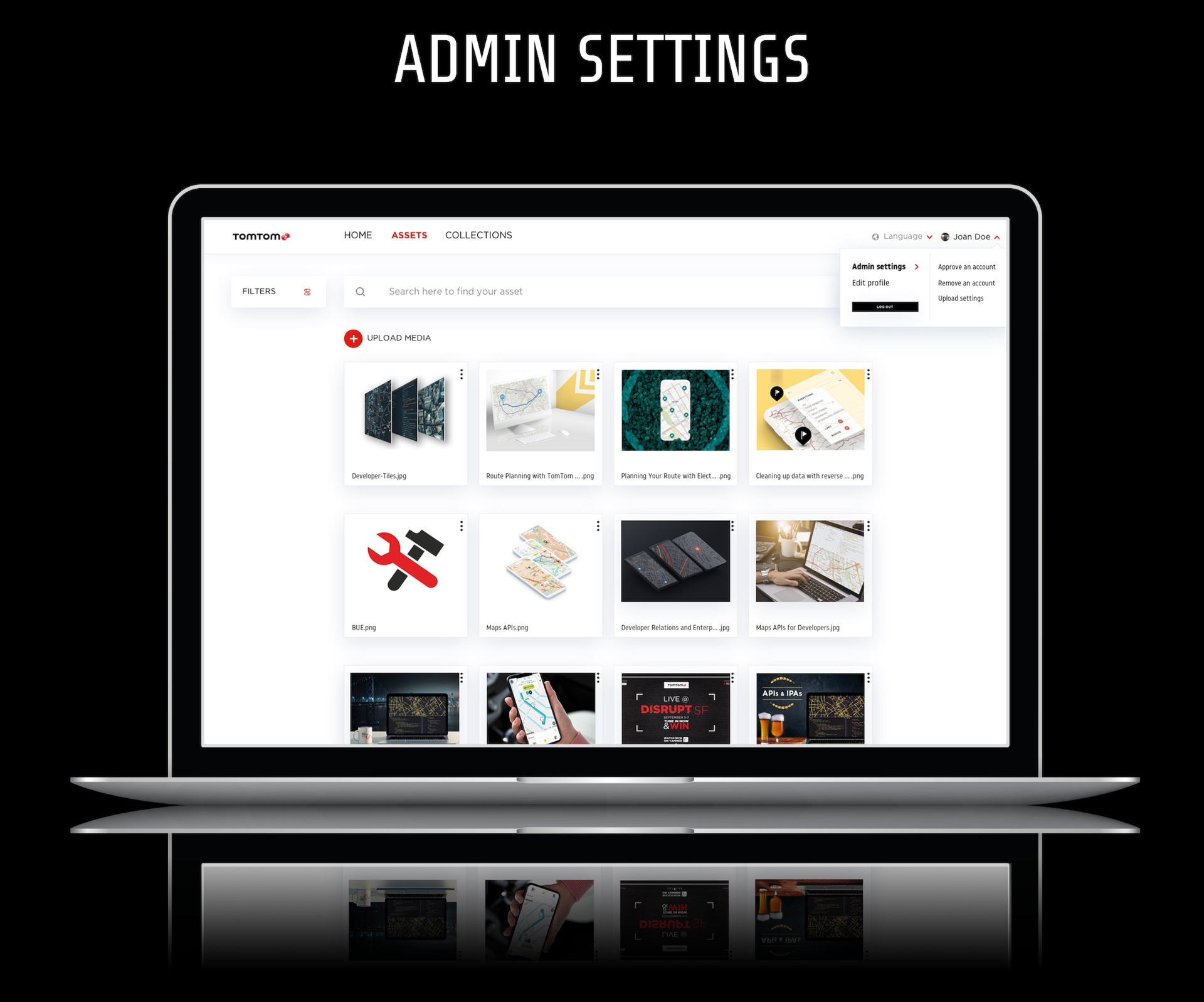
Perhaps it would be helpful to introduce a more explicit placement of the user management tab like “Admin” with a dropdown that not only contains pertinent admin options but also a search bar.
ASSETS & COLLECTIONS
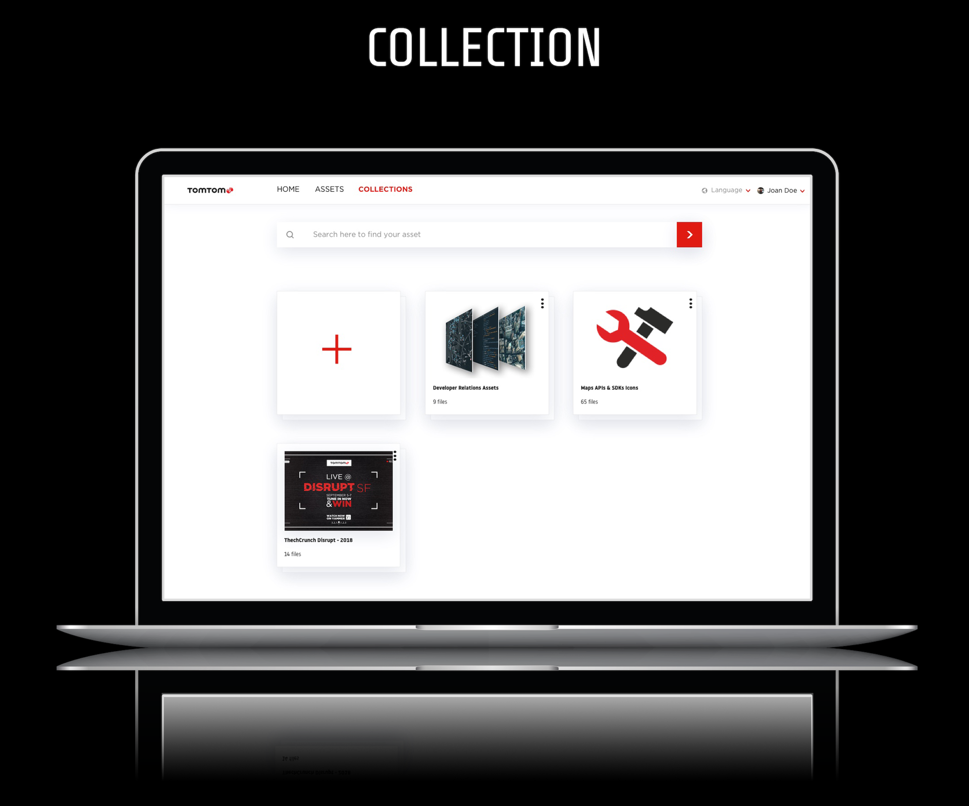
It seems confusing and counter-intuitive to users that there are collections and assets within the library yet no particular structure of the actual content within those tabs. Collections have assets, assets have assets but not collection. It seems that introducing more robust hierarchy and focusing on assets first would be a good solution to address this nomenclature discrepancy. While Assets is the tab used by every user, Collections is something helpful to the niche of employees who are more interested in storing data rather than finding it.
CARD SORT

KEY
TAKEAWAYS
1. Users tend to group the cards by consistency in language (i.e “upload and assign” appear multiple times and get grouped together).
- 2. The groups are sorted by calls to action like “Share”, “Upload”, “Download” etc.
3. The account-related cards seemed to present less of a challenge for participants during the card sort.
2. Assorted calls to action which may appear on one card only, seem to be more challenging to be placed in any category. Perhaps this calls for them to be placed in contextual menu instead of main options.
Per card sort results, there seems to be a necessity to introduce the noun-verb pairing in the menu field, I.e “Collections” and a drop-down with actions (like “create”, “modify” etc) per hover or click.
MODIFIED TASKS

ANALYTICS
Average completion time: 9m42s
Number of participants: 5 people
Average success score across all tasks: 87%
Average number of answers chosen without backtracking: 74%

KEY
TAKEAWAYS
1. Platform successfully restructured.
2. Improvement in search and filtering functionalities showed minimal error margins.
3. Enhancement of the uploading feature with “Options” for each improved and sped up tasks performance.
4. Collections tab with its own ecosystem proved to provide a much desired structure and meet user expectations on searched items.
TASK FLOW
After conducting a thorough user research and analyzing the outcomes, I sketched a raw draft of how we can improve the current task flow. I focused primarily on the Enterprise branch as it’s the department I work in. The key objective was to improved the asset upload, collection creation and admin settings flows.

FINAL SITE MAP / NAVIGATION FLOW
Below is the navigation flow I created identifying the interaction between pages for both stakeholders and asset library managers like myself.

PROPOSED DESIGN
High fidelity wireframes
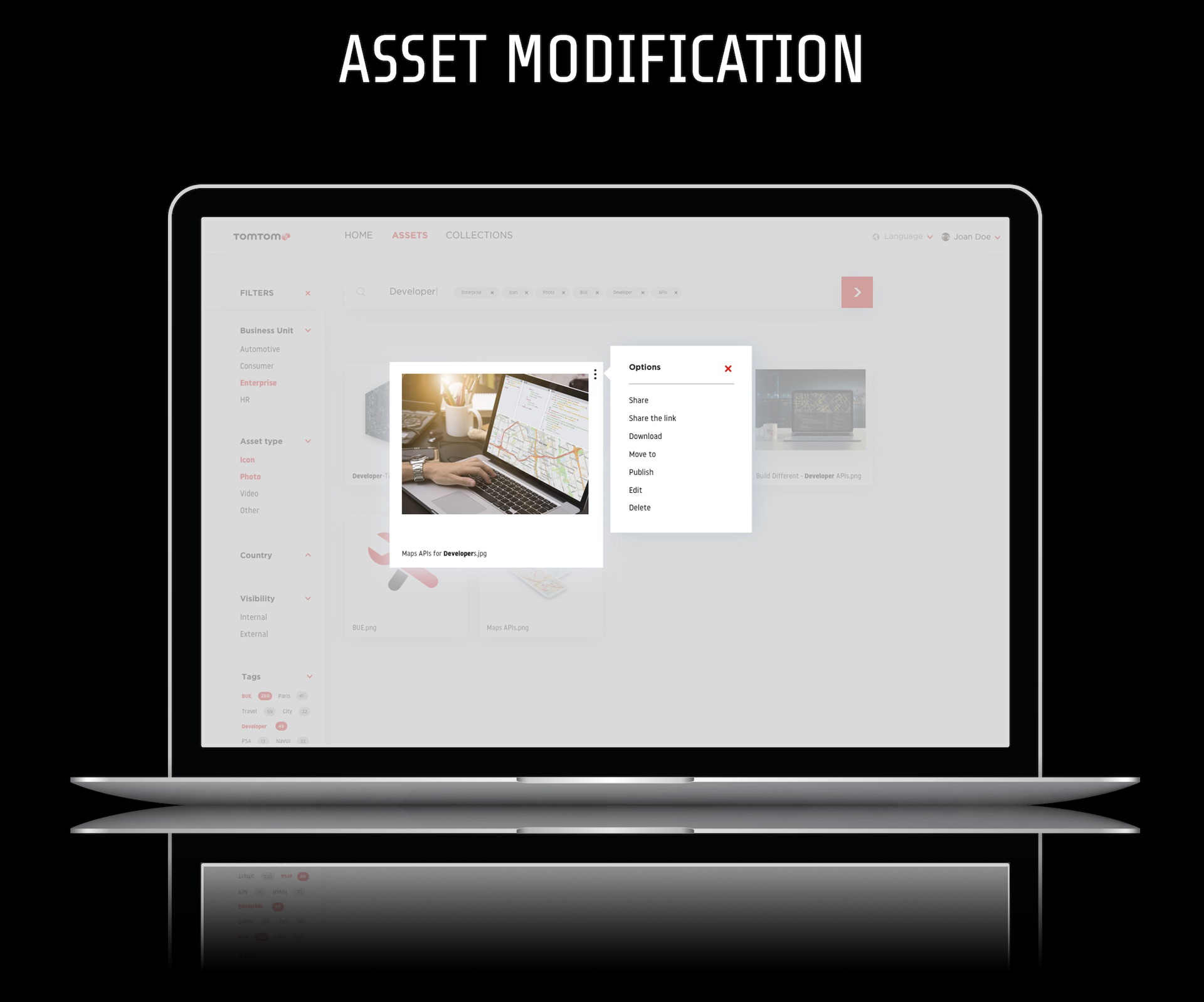
CREATING A COLLECTION
The collection tab is now available with its own search bar in order not to confuse the user. It also has an option to create a collection quickly as well as edit any collection on the spot thanks to the Options menu on the top right-hand corner.
USER MANAGEMENT
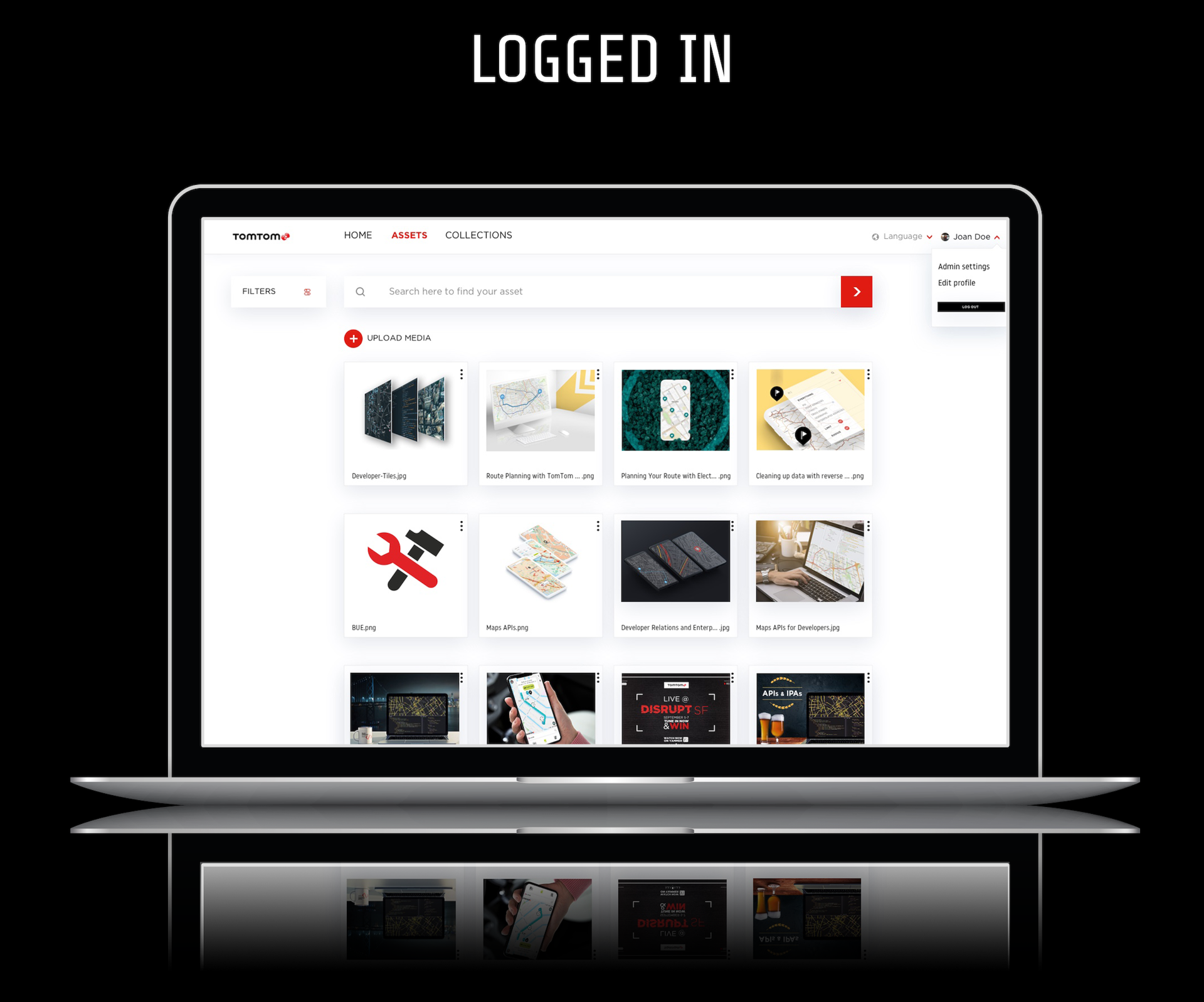
The user management is now represented by the tab “Admin settings” which has all necessary options for account moderators. It is conveniently located within the account tab for the registered user.
ASSETS & COLLECTIONS
Not only clear separation between the two ecosystems – assets and collections proved to work well for users, but also more robust hierarchy and prioritization helped them find the items of interest.